Portfolio Home > Fireclay Trade Portal
Fireclay Trade Portal
Increasing self-service autonomy and transparency through a new Trade Portal for Fireclay Tile.
Project Type
Product Design & Systems
My Role
UX/UI Designer
Tools
Figma
Deliverables
High-Fidelity Prototypes
background
Overview
Fireclay Tile’s most vital asset is its Trade community. Architects, designers, and contractors represent our most consistent repeat customers and command our highest average order value. Beyond the numbers, these professionals serve as our most powerful brand ambassadors in the field.
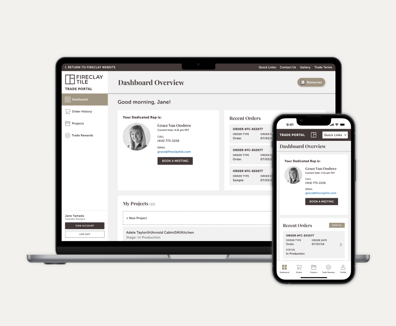
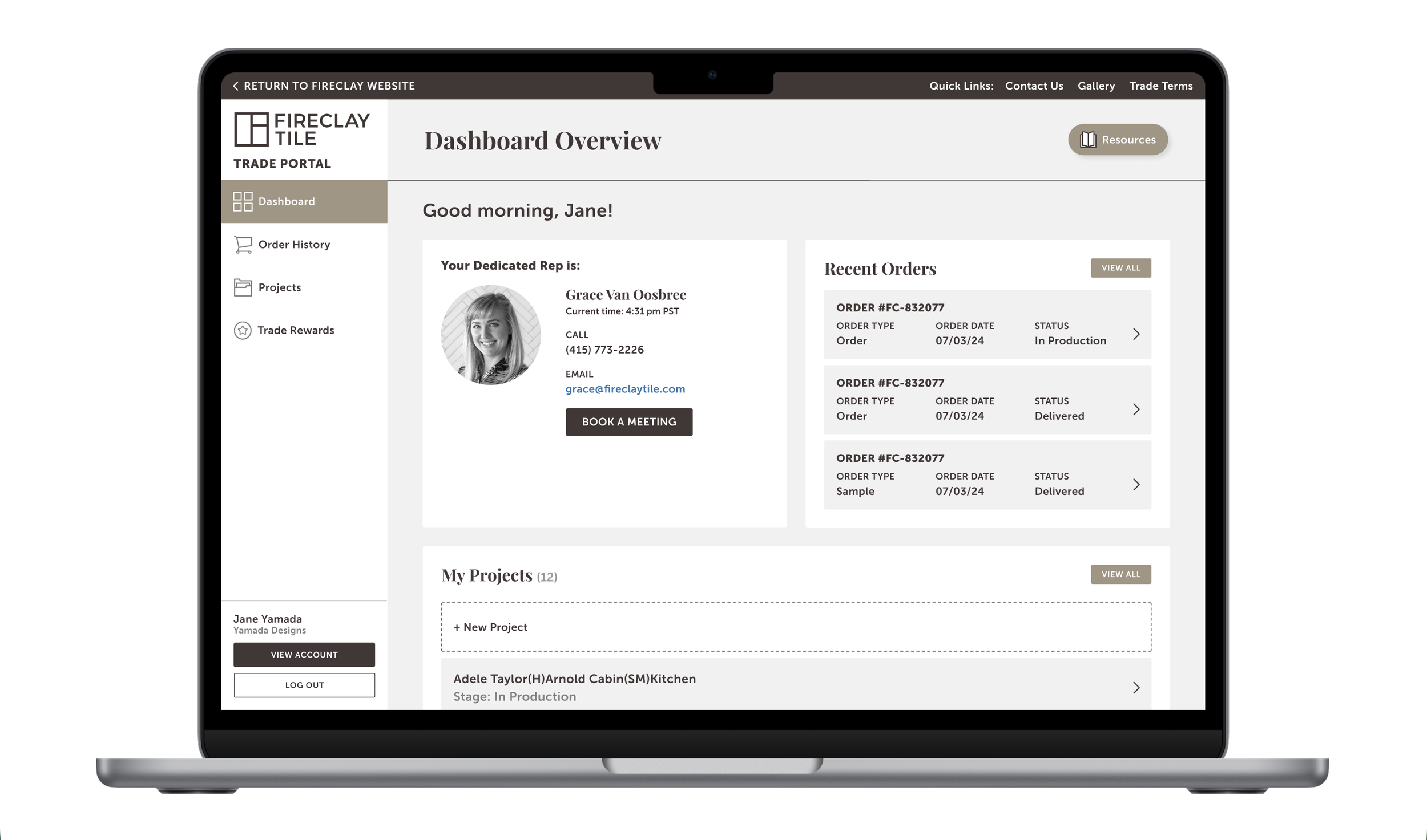
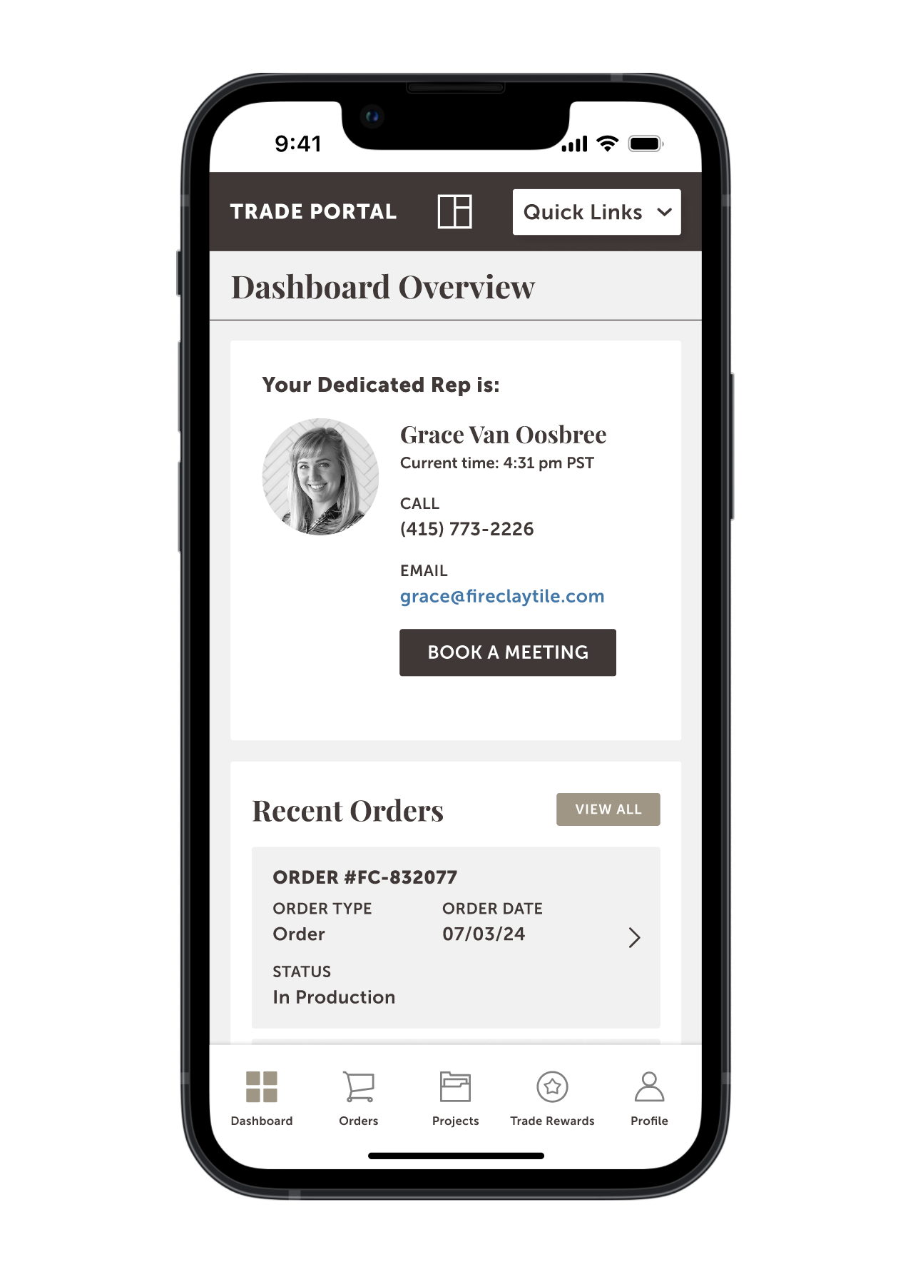
The Trade Portal was designed as the heart of this high-stakes relationship—a dedicated, high-utility environment where pros manage the lifecycle of their projects, from initial sample requests to complex project-wide pricing and logistics.
For these clients, the portal isn't just a website; it’s a project management tool. They require high-precision data and total transparency to keep their builds on schedule.
The Problem
For our highest-value customers, the existing portal was a black box. Trade members, architects and designers running high-stakes projects, were effectively blind to their own data. Simple, daily tasks were buried under layers of friction:
The Manual Barrier: Checking an order status or tracking a delivery often required a phone call or an email to a Sales Rep. This created a bottleneck for the customer and an administrative burden for our team.
Navigation Fatigue: When users did try to find records online, the experience was frustratingly slow and unintuitive, often leading to more support tickets rather than fewer.
The "Tier" Mystery: With a new tiered rewards program on the horizon, there was no visual way for users to track their progress. We needed a data-driven dashboard, where the perks of the program felt attainable.
The Mission
We needed to move from a static record-keeper to an active project partner. My goal was to design a seamless, at-a-glance dashboard that gave Trade members total transparency into their orders and rewards without ever needing to check-in with a human.
Scope & Constraints
Because the engineering lead times were extensive, the feature set was finalized before the design phase began. This created a unique fixed-box challenge: I wasn't defining what the portal did, but rather how it felt and how intuitively it functioned within a pre-defined technical framework.
Technical Guardrails: With the feature set already locked in by the engineering team, my focus was on the visual logic and usability of the existing data points. I had to ensure complex project tracking felt simple, even within a rigid back-end structure.
The "Sprint" Reality: The project moved at a breakneck pace. With a compressed timeline, there was no room for a traditional, months-long discovery phase. I had to rely on my institutional knowledge of the Trade client and a "Ship & Iterate" mindset to meet the launch deadline.
Visual Translation: My primary mission was to take raw data (order logs, tracking numbers, tier points) and translate it into a high-end, luxury dashboard that felt like a concierge service, not a spreadsheet.
Design Process
Task Flows
Since the MVP feature set was already defined, my discovery phase shifted from ideation to optimization. I needed to ensure that these four distinct pillars felt like a single, cohesive ecosystem. I mapped out the task flows for each primary section to identify exactly where a user might hit a wall:
Communication Center: Notifications were a direct bridge to the Fireclay team. It was a centralized hub for messages from Sales Reps, ensuring that critical project updates and quote approvals were never lost in an email inbox.
Order History: I mapped a path that allowed users to jump from a high-level summary of an order directly into the granular tracking data or invoice PDFs in two clicks or less.
Project Management: This flow was about context. I focused on how a designer organizes multiple job sites, ensuring they could toggle between different projects without losing their place in the procurement process.
Trade Perks: I visualized the rewards path, creating a logic where users could instantly see their current tier status and understand the next step required to unlock their next discount or benefit.
The Strategic Pivot
During stakeholder review, the decision was made to de-prioritize the internal messaging hub to ensure a lean, high-impact launch. The technical complexity of syncing a custom portal thread with a Sales Rep’s external email in real-time required significant API development that risked delaying the release. Furthermore, we recognized that for high-stakes project communication, designers still preferred the reliability of their existing email workflows.
High-Fidelity Mockups
Given the accelerated timeline, I moved directly into high-fidelity prototyping to visualize the Trade experience immediately. This approach allowed to present a polished, near-finished product for stakeholder review, accelerating the transition from design to development.
Reflections
Learnings
Constraints as Strategy: Designing for a pre-determined MVP taught me that UX is often about optimization, not invention. Accepting technical boundaries early allowed me to focus 100% on polishing high-value features like Trade Perks and the Project Hub.
Internal Service Design: Pivoting away from a custom messaging hub was a major takeaway. It reminded me that the "user" includes our Sales Reps; a tool that hinders an established, high-stakes workflow is a liability, not an asset.
Utility Over Flourish: B2B tools are workhorses, not just websites. For architects and contractors, value comes from data accuracy and efficiency—like shipping status and reward calculations—rather than aesthetic flourish.
Phase 2 Ideas
The MVP established a high-utility foundation, but our roadmap for Phase 2 focuses on deepening engagement and streamlining the "Project-to-Review" lifecycle. The following enhancements could provide a more interactive experience:
Executive Dashboard: Elevating Member Status and Recent Orders to the landing page to provide immediate, at-a-glance project clarity.
The Feedback Loop: Integrating a review prompt on the dashboard to capture high-quality social proof and project photography directly from our Trade members.
Visualizing Rewards: Replacing text-heavy descriptions with clear infographics that map Qualifying Spend against Cash-Back Percentages, making the program’s value impossible to miss.
Actionable Benefits: Creating a dedicated "Earned Perks" section with one-click redemption paths, reducing the need for manual rep intervention.
Project Favorites: Collaborating with engineering to implement a favorites engine, allowing architects to curate and save project-specific material lists directly within the portal.