Portfolio Home > Fireclay Tile Trade Catalog
Fireclay Tile Trade Catalog
A Research-Driven Redesign of the Fireclay Trade Catalog
Tools
InDesign
Illustrator
Photoshop
Deliverables
Production Files
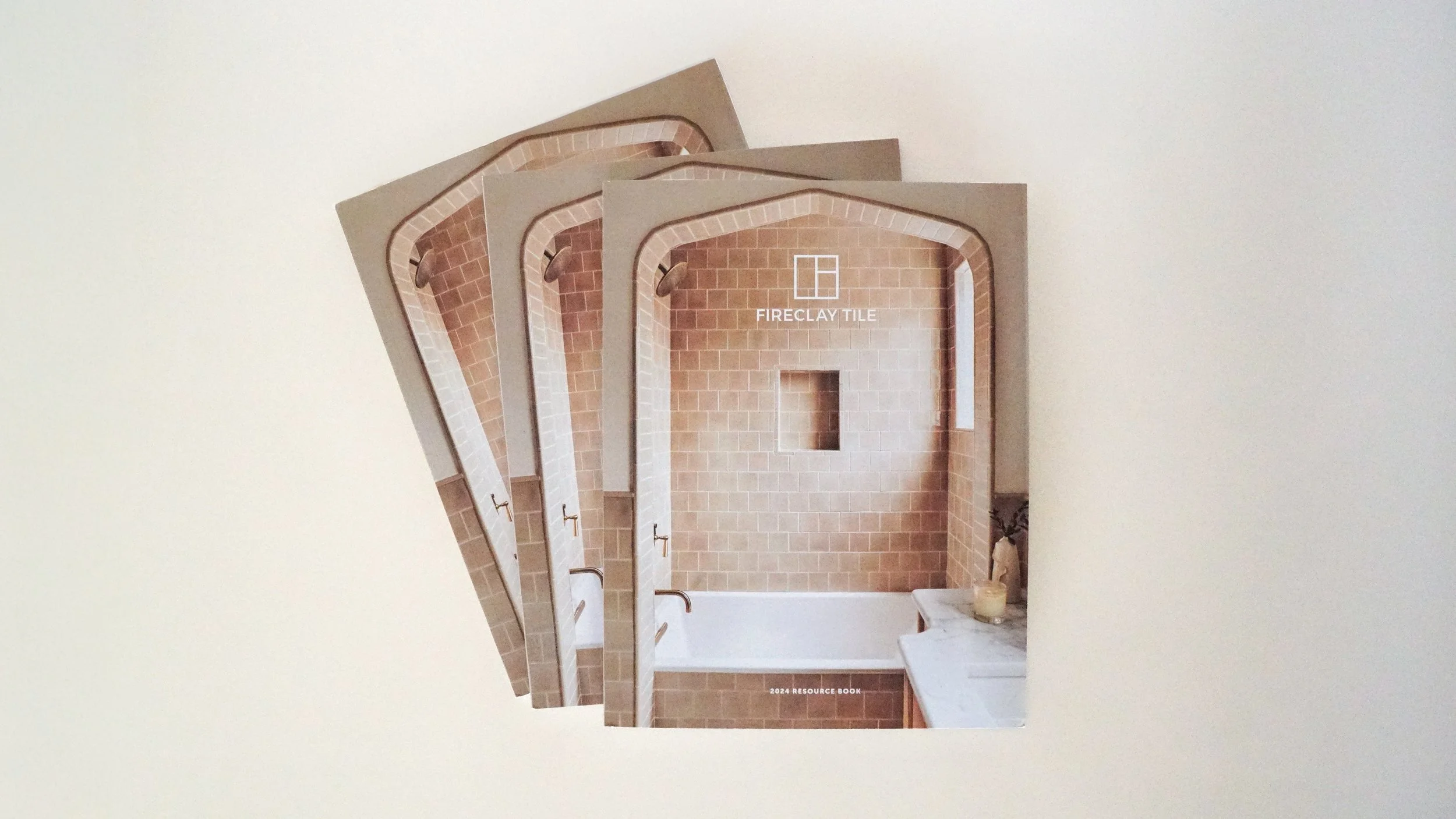
136-page Printed Book
Digital Catalog
Project Type
Editorial and Print
My Role
UX Researcher
Design & Project Lead
Production Strategist
background
Overview
Fireclay Tile makes beautiful, sustainable ceramic tile by hand. To better serve architects and designers, we needed to move beyond a simple brochure. We created a technical roadmap designed for the people who actually build spaces, giving the industry's most detail-oriented professionals the exact specs and inspiration they need to get the job done.
Users & Audience
The trade world is broad, so I designed the catalog to be as useful in a busy architecture firm as it is on a coffee table. I built a layout that balances visual storytelling with the technical precision the industry requires:
Residential Designers: I focused on lifestyle-driven visuals and editorial layouts that help these designers curate a specific mood for home interiors.
Commercial Architects: These projects demand detail. I prioritized easy access to technical specs, custom capabilities, and sustainability data to help architects meet the requirements of large-scale builds.
Scope & Constraints
The project wasn't just a design challenge; it was an exercise in navigating a series of moving targets. To deliver a premium product, I had to solve for three main points of friction:
The Supply Chain Crisis: We were designing in a post-Covid world where paper stock disappeared overnight. I had to constantly vet alternatives with our printer to ensure printing was possible.
The $7 Ceiling: High-end brands usually come with high production budgets, but I was tasked with keeping our per-unit cost under $7. This created a direct conflict between the lifestyle aesthetic we wanted and the raw math of print production.
A Fluid Product Line: While the book was in layout, the manufacturing team was simultaneously auditing our tile assortment. This meant the very content of the catalog was shifting monthly. I had to build a modular system flexible enough to handle late-stage changes without breaking the grid.
Discovery
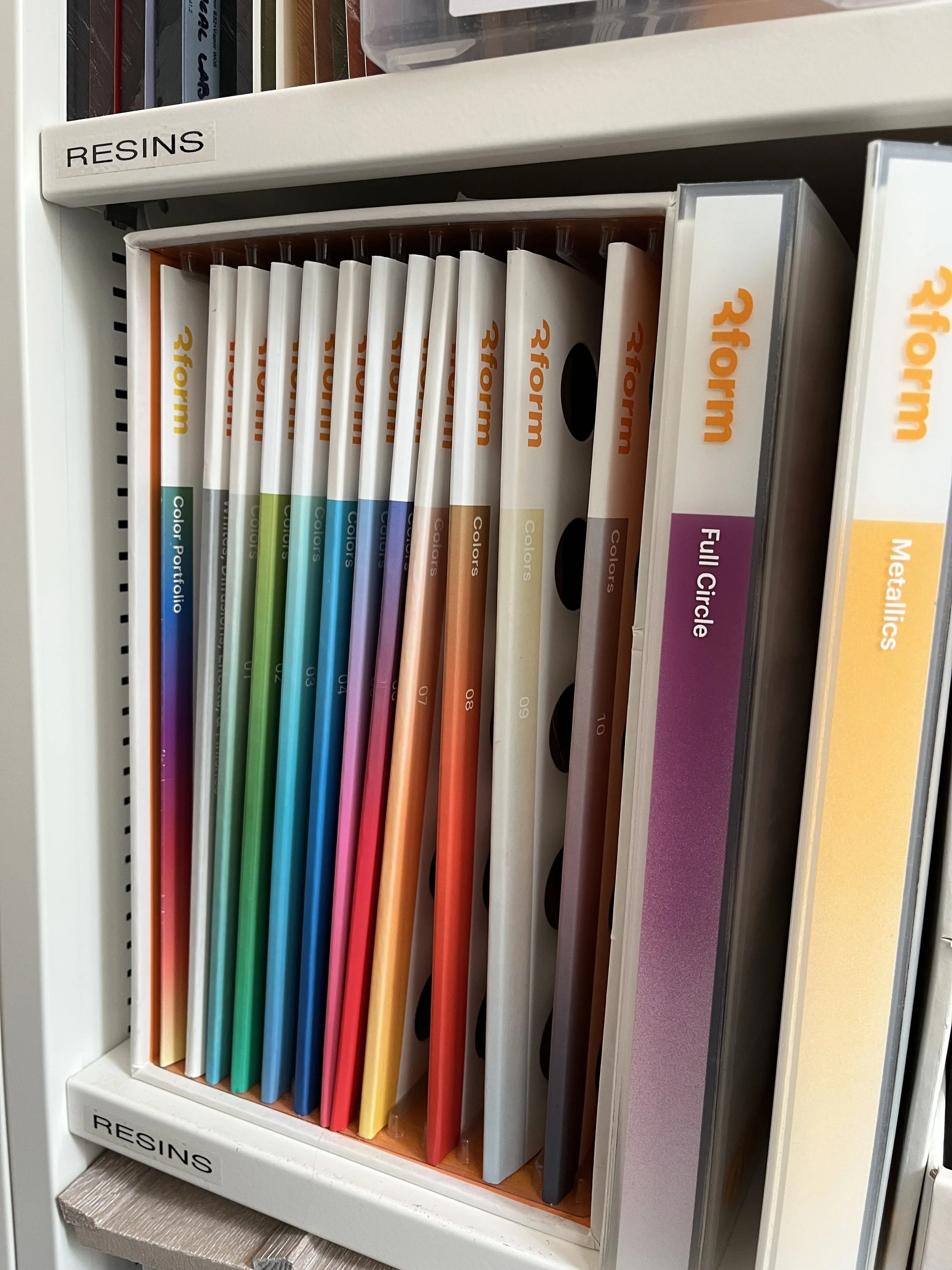
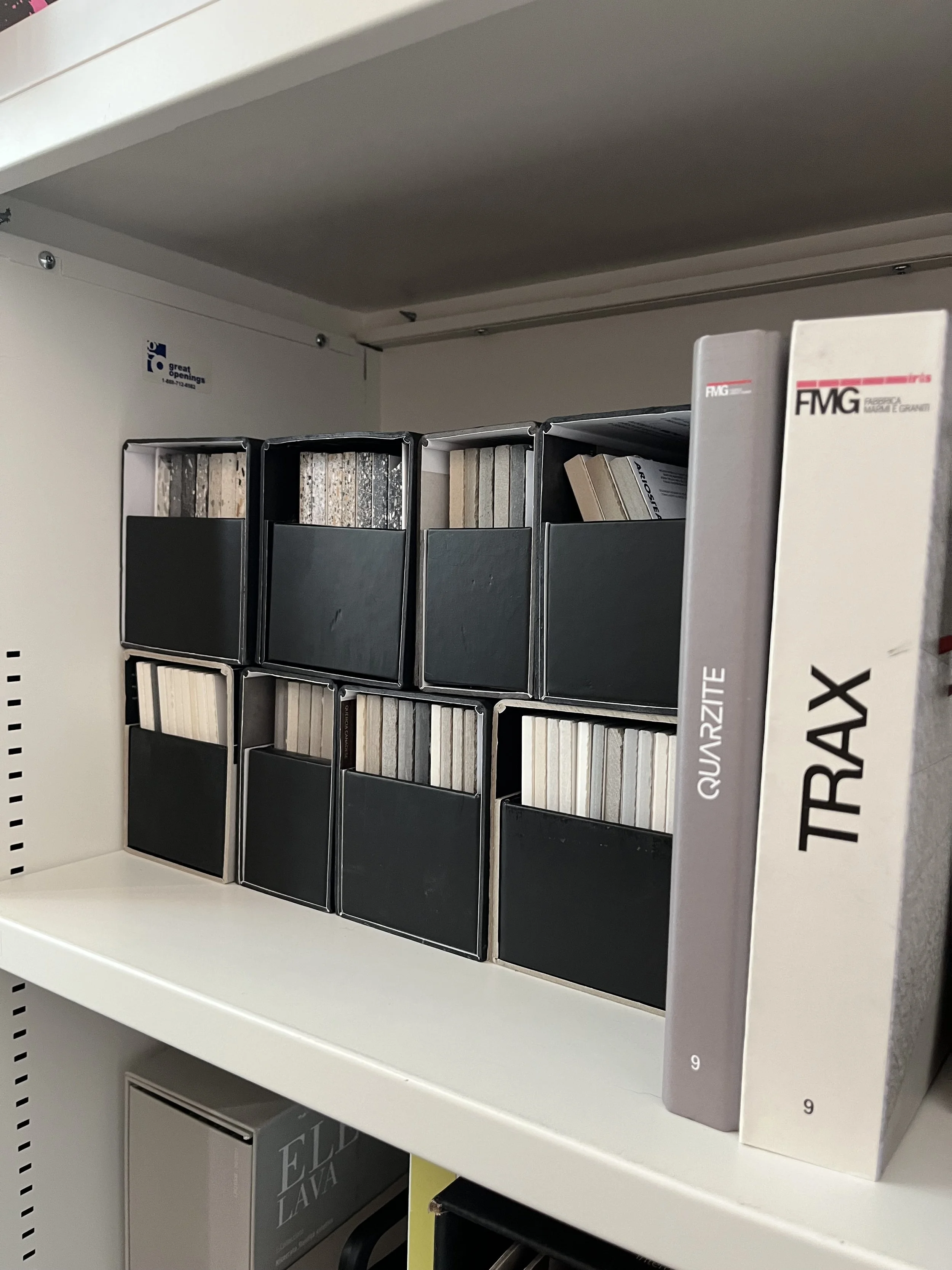
Field Research
Before I touched a single layout, I wanted to see how these catalogs actually lived in a design studio. I spent time in firm material libraries to understand how architects and designers interact with their resources. Key takeaways were:
Durability is Key: Flimsy books get crushed or lost on a crowded shelf. If a catalog doesn't have a spine that stands up or a cover that can handle a coffee spill, it gets tossed.
The Gatekeepers: Larger firms have material librarians who curate what stays and what goes. I realized I wasn't just designing for the architect—I was also designing for the librarian who decides if our book is worth the shelf space.
User Personas
I interviewed five designers and architects from firms of all sizes to talk about their day-to-day. I wanted to hear exactly where they get stuck and what they actually need from a physical catalog. I used those conversations to build three distinct profiles that guided every design decision:
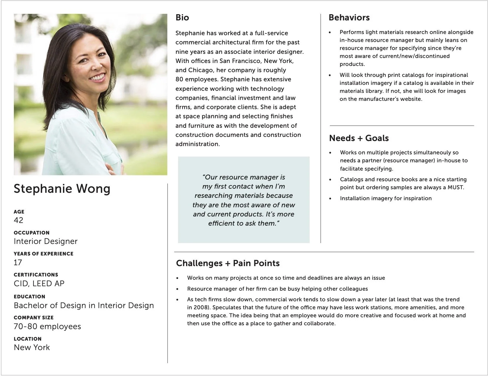
The Associate Designer
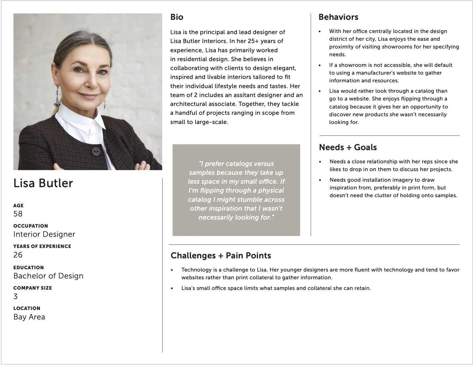
The Principal
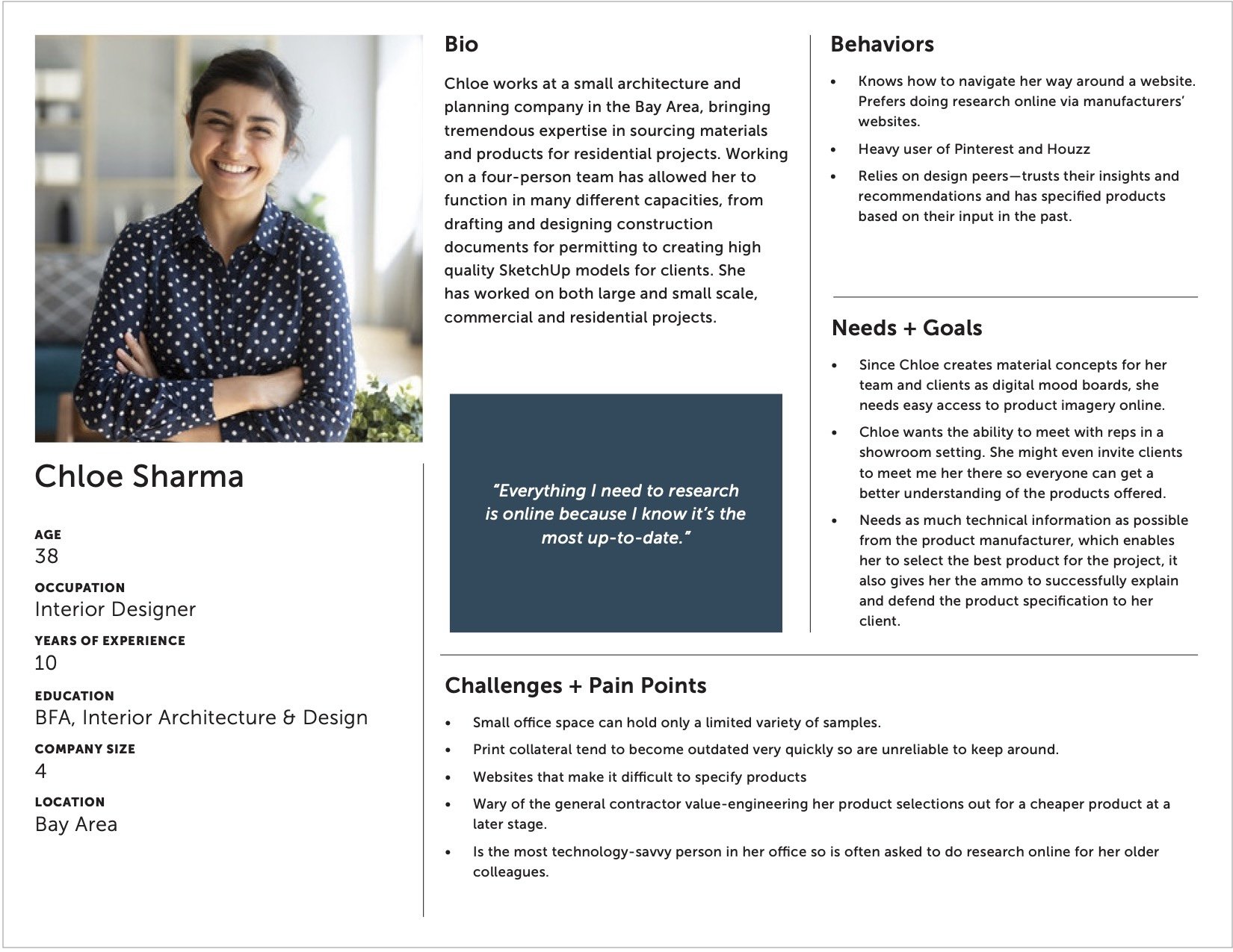
The Junior Specifier
design
Designing for the User
I approached the catalog as a tool for the studio. Every decision was made to help a professional find an answer or sell a vision to their client.
Clear Documentation
I treated every project photo as a resource. Instead of just showing a pretty room, I paired every image with a specific metadata block: products used, designer credits, and location. It turns inspiration into an actionable spec.
Designing for Data
For the architects who need the nitty-gritty, I moved past the aesthetics to show the raw data required for large-scale builds.
Technical Tables: I built standardized charts for every product, covering everything from breaking strength to weight and thickness.
Visual Navigation: Instead of long lists, I used a clean, infographic style for shapes and sizes. It allows a designer to scan the options in seconds.
Value Stories: I designed spreads that explain the artisan process and sustainability practices. This gives our partners the talking points they need to justify a premium price tag to their own clients.
The Build
To make sure the book survived the rigors of use in a busy library, the physical specs were just as important as the layout. I chose a heavy cover and a thick, smooth interior paper that feels substantial in your hands.
Binding: Perfect bound with a visible, sturdy spine.
Cover: 100 lb Cougar Smooth for a premium, matte feel.
Interior: 80 lb Silk Book for a soft touch and crisp, rich color.
Finish: A satin aqueous coating to protect the pages from fingerprints and heavy handling, while also knocking down the glossiness of the page to achieve a more premium feel.
Reflections
The Outcome
The catalog became a staple for the sales team, giving them a high-quality physical resource to initiate conversations with new leads or reengage with cold leads. The success of the project was ultimately reflected in its longevity and demand:
High Demand: After an initial run of 4,000 copies in 2022, the response was strong enough to warrant a direct reprint of 5,000 more in 2023.
Digital Longevity: The print catalog was adapted into a digital resource that is still in active use years later.
Sales Support: Our reps found that having a physical, technical piece made it much easier to initiate meetings with new firms and secure interest in Fireclay’s products.
Learnings
Design as a Business Lever
This project taught me that a designer’s job doesn't end at the edge of the page. By understanding the math behind press sheets and unit costs, I was able to protect the brand’s premium feel even when the budget was tight. I learned that being a good designer often means being a good steward of the company’s resources.
The Power of the Leave-Behind
I saw how much weight a physical object still carries in a digital world. A well-crafted catalog isn’t just a reference tool; it’s a conversation starter. It gives our sales team a reason to walk into a top-tier firm and gives the architect a tactile reminder of Fireclay’s quality long after the meeting is over.
Bridging the Gap
The biggest takeaway was finding the balance between the permanent and the fleeting. While the physical catalog provides the tactile experience, it needs to point back to our digital tools for real-time updates. I now approach print projects with a digital-first mindset for data, ensuring the book stays relevant even as the product line evolves.