Portfolio Home > Fireclay Tile Website Navigation
Fireclay Tile Website Navigation
Redesigning Fireclay’s navigation to scale with product and service launches
Project Type
Information Architecture
Navigation Design
My Role
UX/UI Designer
Tools
Google Forms
Figma
Deliverables
High-Fidelity Prototypes
background
Overview
In late 2024, Fireclay Tile moved beyond the wall and floor with the launch of Fireclay Bath. This new category introduced a curated collection of high-end fixtures—faucets, shower heads, and bath fillers—designed to complement our handmade tiles.
Problem
As Fireclay evolved into a multi-category home brand, our original navigation hit a breaking point. The stacked menu, built for a tile-centric product offering, created some friction for the user:
Cognitive Overload: The more we added, the harder it was to find anything. The menu felt cluttered, leading to accidental activations and a frustrating hover experience.
Categorical Obscurity: By nesting a major launch like Fireclay Bath within a tile-centric menu, we risked the new category being viewed as an accessory rather than a flagship offering.
Growth Limits: We knew the two-year roadmap included even more product lines and services. We didn't just need a new menu; we needed a scalable logic that could handle a rapidly expanding ecosystem without a total redesign every six months.
Discovery
Competitor Benchmarking
I performed a predesign audit of Fireclay’s navigation and comparative analysis against industry leaders like Clé Tile and Zia Tile as well as luxury brands like Waterworks and Ann Sacks for companies that already exist in the multi-category home sector.
Key Takeaway #1
The Paradox of Choice: Fireclay’s 15 top-level links were creating immediate decision fatigue. The audit showed that industry leaders successfully guide users with half that many options, creating a much more prestige feel.
Key Takeaway #2
The Ideal Depth: I noticed a wide split between flat and nested navigation. Clé Tile, for example, went four levels deep, which felt like a labyrinth. I determined that three levels of nesting was the "sweet spot"—deep enough to be organized, but shallow enough to keep the user from getting lost.
Key Takeaway #3
Visual Quiet: The luxury brands (Waterworks, Ann Sacks) prioritized white space and a clear hierarchy. They didn't shout every product at the user at once; they invited them in through a curated entry point.
Internal Insights
While the competitor audit gave me a benchmark for luxury, I knew the real story lived with our teams. Our Sales, Client Success, and Marketing teams are in the trenches with customers every day, so I surveyed them to find the recurring friction points that a website audit alone might miss.
Common Themes
The Education Gap: I learned that clients often struggle to distinguish between our two primary ceramic lines. Since this choice fundamentally changes how a project begins, I knew the new navigation had to do more than just list products—it needed to educate the user from the first click.
Resource Friction: Our Support team was spending significant time manually sending out spec sheets and installation guides. This proved that our technical assets were buried too deep, making self-service difficult for busy trade professionals.
Technical Frustration: The physical stacked design of the old menu was failing. Top-level dropdowns were literally obscuring lower-level links, creating a "clumsy" digital experience that didn't match the premium quality of our products.
“Most of my support tickets are sending spec sheets or installation guides. Can we make it easier for clients to find them?”
The Strategy
With a clear understanding of the market and the friction points felt by our internal teams, I developed a navigation strategy centered on three pillars:
Categorical Clarity (The "Education" Fix): Instead of just listing products, I included simple product overviews to help users immediately distinguish between our primary material lines. This addressed the "Education Gap" identified by our sales team, ensuring customers start their journey with the right information.
Surface-Level Utility (The "Friction" Fix): To reduce the burden on our Support team, I prioritized single-click access to technical spec sheets and installation guides. By moving these resources out from behind deep nested menus, we empowered trade pros to self-serve in seconds.
Architecture for Expansion (The "Future-Proof" Fix): I replaced the fragile stacked menu with a scalable grid system. This resolved the usability frustrations of overlapping dropdowns while creating a distinct logical divide between Tile and Bath—giving our new product category room to grow without burying it.
Design Process
Information Architecture
With the strategy set, I moved into the blueprint phase. I built a new tree diagram to map out the pieces of content that would live within the dropdowns. This helped me think through a couple of things:
Team Alignment: By mapping the information architecture early, I gave the Web Development and Marketing teams a clear view of the project's scope long before we reached the high-fidelity stage. It ensured everyone was on the same page regarding what needed to be built and what content needed to be written.
Future-Proofing: The tree diagram allowed me to stress-test the new structure against our two-year roadmap. I could physically see how a new product line, like a future Lighting or Hardware category, would slot into the system without breaking the existing logic.
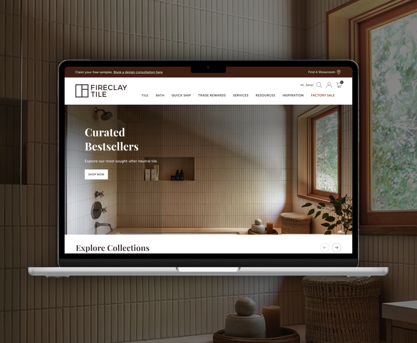
Image: Old navigation with stacked structure
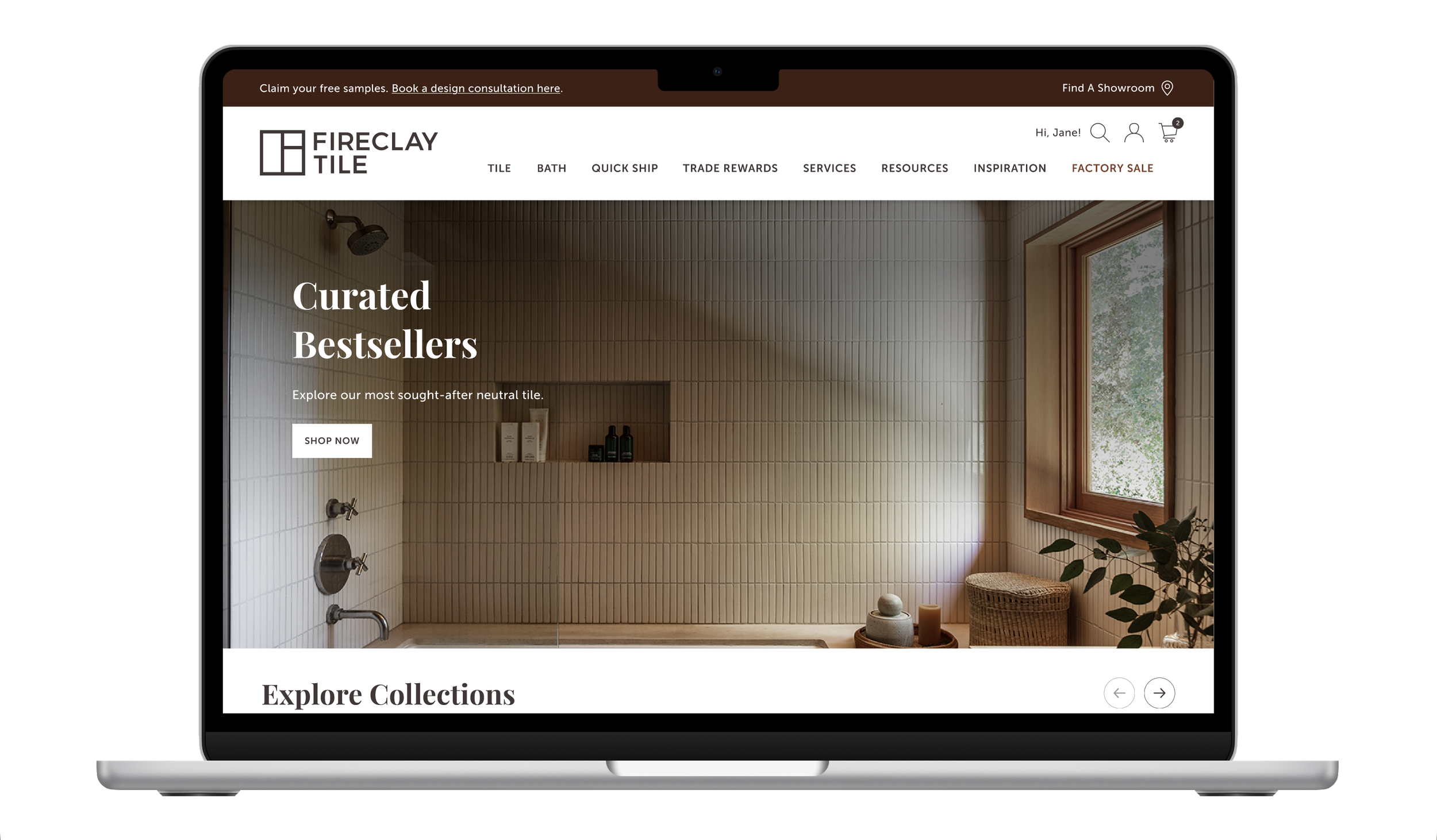
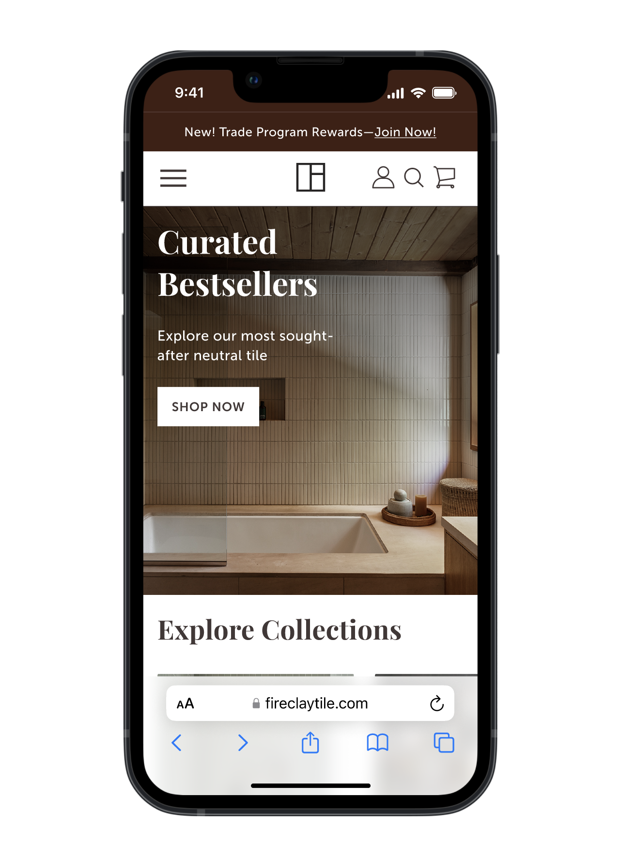
Image: New navigation
High-Fidelity Mockups
I moved into Figma to bring the new navigation to life, building out fully interactive prototypes that let our stakeholders feel the new experience before a single line of code was written.
Interactive Testing: Instead of static screens, I built out the hover states and transition logic. This allowed the Sales and Support teams to walk through the new education and resource paths, ensuring the technical frustrations of the old menu were addressed.
Refining the Luxury Feel: The prototypes allowed me to fine-tune the "Visual Quiet" identified in the audit. I experimented with white space, typography, and image-rich dropdowns to ensure the overall experience felt more editorial.
Alignment through Action: Sharing these prototypes wasn't just about getting feedback—it was about building confidence across the organization. Seeing the new system scale seamlessly from Tile to Bath gave confidence that our two-year roadmap finally had a digital home.
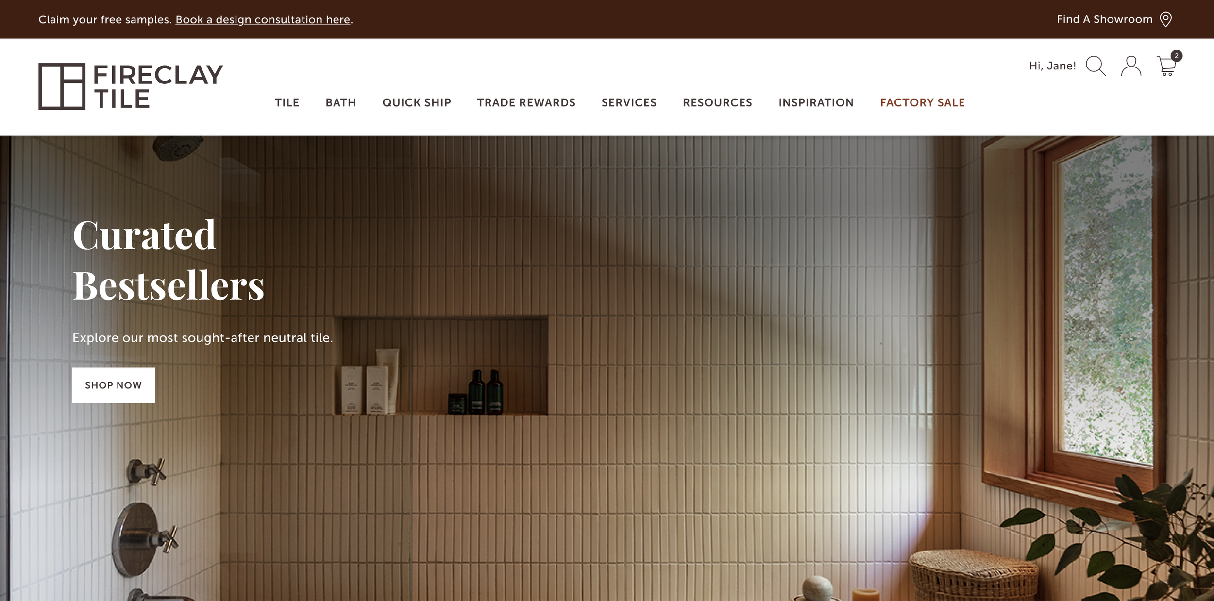
Consolidating multiple product subcategories into a single Tile parent reduced visual clutter and cognitive overload and allowed a simpler navigation with only 8 primary links.
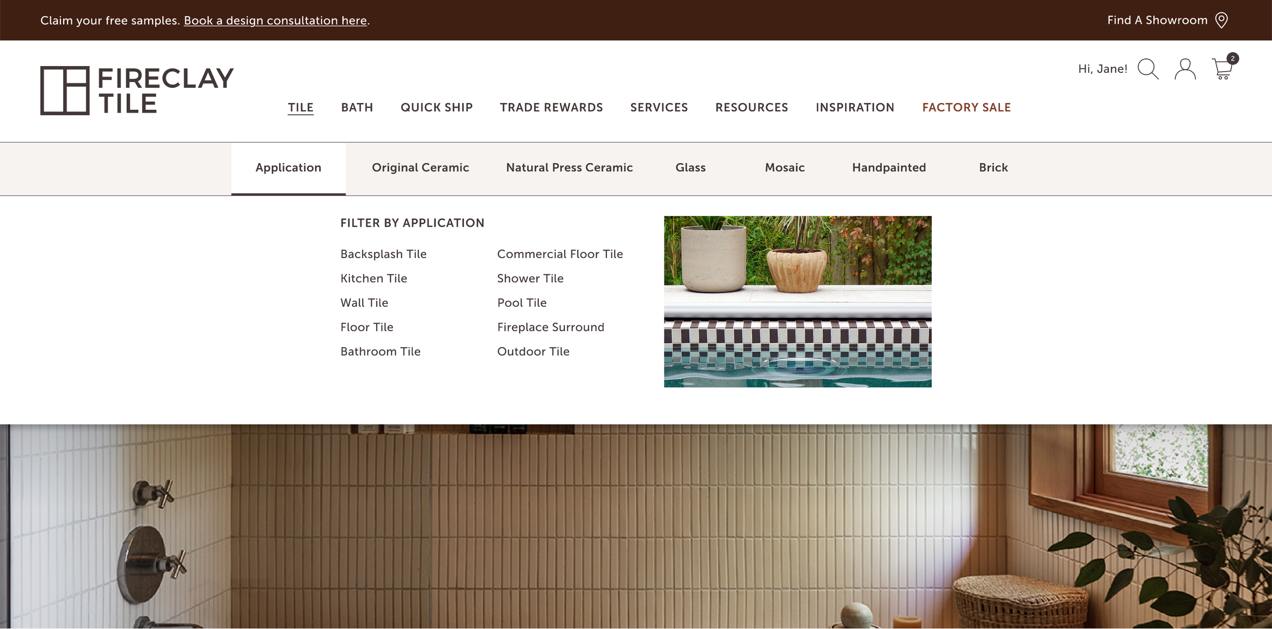
Addressed Education Gap: The "Shop by Application" filter guided users toward products engineered for their specific environment, educating users on which tile products suited their applications.
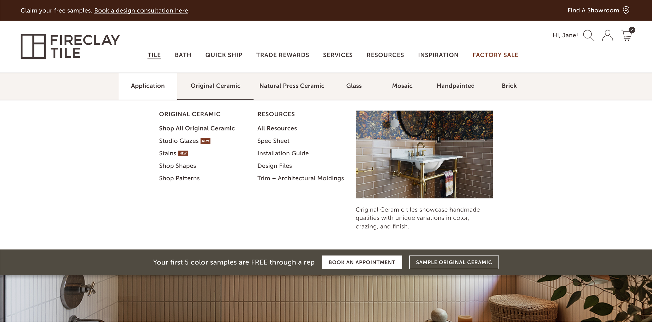
I moved away from dense, text-heavy menus in favor of an image-rich grid. This visual quiet reduces cognitive load, allowing users to intuitively navigate between product education and technical resources without feeling overwhelmed.
Reflections
The Outcome
The redesign moved Fireclay from a rigid, product-heavy menu to a flexible, intent-driven architecture. By the time we launched, the navigation didn't just look better—it functioned as a scalable engine for the brand’s expansion.
Lowering the Noise: I consolidated dozens of subcategories into a single, organized Tile parent. This cut the primary navigation from 15 links down to 8, immediately removing the decision fatigue and cognitive load that had plagued the old site.
A Launchpad for Bath: The new hierarchy gave our Bath category a flagship home without burying it. More importantly, we built a framework that can now absorb future product launches over the next two years without a total overhaul.
Closing the Education Gap: By introducing an Application dropdown, we turned the navigation into a teaching tool. Users are now guided toward products engineered for their specific needs before they ever have to ask a sales rep for help.
Empowering Self-Service: We moved technical spec sheets and installation guides from the "basement" of the site to the top-level dropdowns. This directly addressed the primary frustration of our Sales and Support teams, allowing pros to find the data they need in seconds.
Learnings
Every project at this scale teaches you something about the "why" behind the "what." This launch was a masterclass in building for the long term:
The Power of Internal Insight: When formal external testing isn't an option, your internal teams are your greatest asset. Sales and Support are in the trenches every day—they are the ultimate "proxies" for user behavior. By listening to them, I was able to solve real-world frustrations that a standard UI audit would have missed.
Architecture as Strategy: I realized that Information Architecture isn't just about organizing links; it’s a business enabler. A solid IA provides the foundation for brand expansion, preparing the company for its next two years of growth before the products even exist.
Design as a Consultant: I moved the navigation from a "passive list" to an "active consultant." By focusing on "Application" (where the tile is going) rather than just "Product" (what the tile is), we created a premium, helpful experience that guides the user instead of just showing them a catalog.